Saturday, May 30, 2009

Designer Spotlight: Cindy Rinfret


Talented designers abound in our country. Designers whose work rises to the top. Cindy Rinfret is one of these. I have watched her work through the years as it has appeared in many of my favorite shelter magazines, and I am always excited when I see a new feature done about her.


Close-up shot of a beautiful secretary.


This living room sort of channels Elsie de Wolfe with the trellis-covered walls.

Cindy was educated at the Rhode Island School of Design and the Copenhagen School of Architecture. She worked in New York City before moving to Greenwich, Connecticut. It is in Greenwich that her work seems to have blossomed and thrived. Here, in one of the most affluent regions of the country, Cindy is able to work her magic not only in the more formal homes there, but also in country retreats and beach front getaways.


A beautiful bedroom with serene blues and greens. I love the placement of the bed at the window. Window treatment and canopy all in one!


A pretty hallway with some of Cindy's signature window treatments.

Cindy's work has appeared in numerous publications, some of which are Traditional Home, Better Homes and Gardens specialty magazines such as Window and Wall Ideas, Greenwich area home magazines, as well as being featured on HGTV. A ten-page spread was done on her work in Chris Madden's Bedroom Book. She has also authored a book called Classic Greenwich Style with a forward written by the design greats Bunny Williams and John Roselli. ( Some company she keeps there!)


Cindy's design style is rooted in the classics. She uses fabrics in lush, creative ways and is a master at mixing color and pattern.


This bedroom shows the Rinfret mix; soft colors, abundant fabric yardage, classically styled furniture. Even the ceiling has detail.


Serene bath with a sort of Swedish feel. I particularly like the tall marble backsplash on the tub.


Her portfolio shows several shots of rooms in which both rustic and classic are mixed. I would assume a lot of this work was done for clients with country houses. I like the way she doesn't let these rooms get too "themed" and cutesy.


I have always been a devotee of the English country house look and Cindy Rinfret does this look well. Her rooms are layered and detailed. Rooms where families can really live.


This bath is so pretty. Classic London shade and wallpaper.

When I think of the designers I most admire, it is always the ones who take the classics and make them their own. They admit they are not trying to re-invent the wheel, but appreciate tried and true forms and interpret them in an original way.


Classic furniture with a natural fiber rug to dress it down paired with rustic accessories. Hand-painted mural no doubt ties in with a country landscape outside.


Symmetry and slipcovers. Very elegant.


French furniture appears in Rinfret's work quite often. (Probably helps explain my love for her work!)


I wonder if she specified this bedroom built-in. I covet it so much!


A very feminine and very beautiful sitting area.

This dining room illustrates a more pared-down version of Rinfret. Still love it!


Seagrass tones down the florals for a soft and pretty bedroom.


If you fortunate enough to be in the Greenwich area, Cindy Rinfret also has a retail shop. I am sure her style is evident in everything for sale here.

I hope you have enjoyed this tour of everything Cindy Rinfret. Traditional but fresh, her design style is classic and timeless.

Friday, May 29, 2009

He Said, She Said (or the Venus/Mars Dilemna in Decorating)

(This was originally posted by me on 2/6/09. I just listened to today's edition of The Skirted Roundtable http://www.theskirtedroundtable.blogspot.com/ and I thought I would re-post it. I guess we all suffer through this!)

"It is the personality of the mistress that the home expresses. Men are forever guests in our homes, no matter how much happiness they may find there." (Elsie de Wolfe)
(Politically incorrect , yes, but in reality most women seem to agree!)


As a designer who has been the around the proverbial block a few times, I can tell you that a recurring theme (and problem!) in my work is the sometimes wide divide that occurs between the little woman of the house and her significant other. Often it turns out that I feel more like a decorating therapist than anything else, and believe me, I think it may be the one area that separates the women from the girls. It takes some tact and finesse, my friends.


(Since I want to keep working in this town, all names have been changed and any likeness to persons living or dead is purely coincidental! )


Case #1: This was a lovely couple, of the same age group as my parents. I had been called to update their small but hugely successful business. She had been the one to contact me, so I felt duty-bound to be true to her first. The problem was, as most couples of their generation do, HE controlled the purse strings. Every day was a negotiation. She wanted it, she loved it, and he was absolutely in sticker shock. Keep in mind this was early in my career and my prices were anything but expensive. I would stand between them while they had me interpret. Example: She: We need to update this place and I like all your ideas. Tell him I said so! He: You tell her I'm not made of money! Does she remember how much it cost to build this place in 1963?!!


OKAY! OKAY!! Now I am feeling like I am twelve and in the middle of my parents bickering. Not good. But somehow I navigated this storm. We compromised and she got most of the things she wanted. But I'll tell you what. I learned that the He Said, She Said War was not for the faint of heart.


Here are some common recurring themes along these lines that I run into:


She said: I want help with these panelled walls from the '70's. Should we paint them, spackle over them, or just gut the place?


He said: I love this panelling. It gives the place character. Besides, does she think I'm made of money?

She said: We need some new furniture. We have had this stuff since we got married and have reached a place where major updates are in order. I deserve it!


He said:: I like this naugahyde recliner just fine. It is molded to my butt and feels like an old friend. And that duct tape on the side just adds to the character!


She said: I want some color! I want something that is pretty and adds personality.


He said: Beige. I want beige. Everywhere.


She said: How can we conceal this huge television?


He said: How can we arrange things so I can see the television from every angle in the house?


She said: I want hardwood floors with beautiful rugs in the seating areas.


He said: Why would you want to cover up awesome hardwoods with a bunch of expensive rugs?


Case #2 Again a great couple. Just a little far apart on the goals for the project. On the first visit, it was obvious that this was one sweet couple. They welcomed us in and explained that they had had some work done previously but really weren't happy with it.


He said: We just need a few changes to complete the look the other designer did.


She said: Yes! Of course! Just a few changes and add-ons. (Wink, Wink.)


This is what we did:


The clients moved out.


We repainted the entire interior.


We took out all the interior trim and doors and replaced them with upgraded versions, complete with new hardware.


We tore out all the countertops and replaced them with new granite tops.


All the furniture was sold and replaced. All new window treatments were fabricated and installed. Some silk.


New EXTERIOR windows and shutters were installed.


A new custom built fireplace was installed in the master bedroom.


All new lighting throughout the house.


New tile in kitchen and baths.


All new artwork and accesssories throughout.


All family photographs re-framed and displayed.


New bedding, decorative pillows, and linens.

New floorcovering and rugs.


New built-in cabinetry throughout the house.


This turned out to be an absolutely wonderful project. A lovely couple. A lot of hard work. But in the end, what the girl wants, the girl gets!

Friday, May 22, 2009

No Virginia, There Is No Magic Formula!


This Thursday's design topic on The Skirted Roundtable (http://www.theskirtedroundtable.blogspot.com/) involved art in the home; choosing it, hanging it, editing collections of it, etc. Every aspect of hanging art was touched on; how high, how low, whether to match or not match, family photos displayed or not. Each designer seems to approach this aspect of design a little differently.


As I listened to Linda, Joni, and Megan argue, ahem, I mean discuss their opinions on all this, a very big thing stuck out to me; there isn't always a sure-fire formula for many of the design dilemnas we often face. I think sometimes you just work from instinct, something innate. It's a way of seeing things that sometimes cannot be explained.


To be sure, there are design principles that always hold true, but, as they say, rules are sometimes meant to be broken, too. Design isn't an exact science, as much as we wish it were sometimes.


Sometimes more is more...


Sometimes hanging isn't even the answer...


Here we have these three successful designers, and they have three very distinct visions in dealing with hanging art. And I am sure any installation done by any one of the three would be fabulous.


Mirror on mirror can be very effective...


I think if there is one thing we can be sure of, it is that design is art and therefore individual interpretation of the principals of design will always vary somewhat. What is important is the finished product, the creative flow between the interior and the designer.


Sometimes less is more...


(And to Joni, Linda, and Megan: Vive la difference!)

Monday, May 18, 2009

Paint is Our Friend


I just listened to this Tuesday's edition of the Skirted Roundtable (http://www.theskirtedroundtable.blogspot.com/) and the discussion on paint. In my design business this is absolutely one of the biggest questions I get, so I thought I would expand on the discussion and offer some of my experiences with paint and discuss some common paint concerns.

As Megan says, paint gives a lot of decorating bang for the buck and is easier to undo than any other decorating decision. But, interestingly enough, in my experience, it is the one thing people seem to be the most afraid of. Maybe because it often covers large amounts of space, it seems overwhelming and too permanent, but it definitely isn't.

I don't know the name of this paint color, but this is typical of a color scheme I admire; creams and golds. I have used a Sherwin-Williams color similar to this called Blonde. (Designer: Jan Showers)


Colors evoke feelings and emotions. Look at your space and really think about the role the room plays in your life. What parts of the day do you spend the most time in the room. Maybe you want a more energizing color in a room where you spend more waking hours and peaceful, soothing colors where you spend time winding down in the evening.


A very soothing, sand colored bedroom with white linens. A similar color I like is Benjamin Moore Monroe Bisque.

Here are some of my ways approaching paint colors.

Use colors that you love and gravitate toward, not just what is trendy. For example, I am just not a blue person usually, so I rarely use it on walls. If I do use blue, it always is on the green end of the spectrum. Some ways of decoding your color likes are magazine pictures, looking at fabrics and noting the colors you are drawn to, looking in your closet, look outside your window at nature and observe what stands out to your eye. A beautiful shade that you love will be a joy to you forever. Don't use a color just because it is the "color du jour". I have been in housing developments where virtually every house has the same paint color. Not good.

After you narrow your palette a bit, give some thought as to the amount of depth or saturation of color that you are most comfortable with; do you like soft, more pastel shades or deeper tones? Maybe bright, clear color is more your thing. It's your personal space and color is indeed very personal.


A room by Barry Dixon. I have used a similar color called Earthy Ochre by Pittsburgh.

Another suggestion I have is to keep your palette in your home fairly small, being careful not to use too many different colors in different rooms. Paint colors are like crayons and it is tempting use a smorgasbord of them, but don't. I find it best to use around three different wall colors and add interest by playing with the depth of these same colors. In other words, use different shades and tones of your palette to change things up a little rather than using a lot of distinctly different colors. That just chops a house up too much.


A beautiful dining room designed by Eric Lysdahl. I have used a color reminiscent of this by Benjamin Moore called Palladian Blue.


A perfect example of how deep, rich colors don't equal dark and depressing. The use of light fabrics and accessories make the dark walls a perfect backdrop.


I absolutely LOVE this room. Pairing a rather unusual wall color with elegant rugs and furnishings. This is where a professional can help think outside the color box. Context. The homeowner here may have felt a little worried when this color started going on the walls, but in context of the whole design it is stunning. Trust is important!


A fresh green breakfast room. Look how the wall color brings the outdoors in. Again, this may have been shocking in the beginning, but with the blue and white toile fabric and traditional furniture, it is not kid-like at all.


Some common questions I get and my take on them:


Q. What if I get tired of it?
A. Bad news. You probably will. Hopefully, if we do this right, it will be a long time, but in the end you spend a lot of time in your house and things eventually just feel tired after some time. Good news. Paint is your friend. It is relatively inexpensive and easy to change.


Q. I think I can save some money and do the work myself. What do you think?


A. Maybe, but probably not a good idea. Painting, like lots of things in the design world, may look easy, but isn't. A good professional painter does this every day. He has the tools and the skills to make your house look like a million bucks. Watching a pro with a good paint brush will almost make you think you're watching Van Gogh. If you can, budget for a professional.


Q. I like pastels and shades of white but my friend says this is "so yesterday". What do you think?


A. Well, who do you trust, me or your friend? (I have a running joke where I say, "If your mother-in-law or best friend hates it, go for it. It's a hit!") Do what fits you. Forget about everybody else.


Q. Can I just keep my "builder"paint for now, decorate everything else, and maybe paint later?


A. Theoretically, yes. But do you really want to invest in designing around banality? Paint now, then build from there. Backgrounds should come first.


Q. Light colors make a space look bigger, right?


A. It depends. Although it seems counterintuitive, I usually use darker colors in smaller spaces to play up their coziness and lighter or mid-tone colors in larger spaces.

If you really want some professional color advice and education, I suggest you go to http://www.colourmehappyblog.blogspot.com/. Maria is a professional color consultant and I find her color wisdom to be dead-on every time.


Decorating involves utilizing many tools. Paint is at the top of the list. It is economical and can set the tone for mood and personality. It is pure color and color is the visualization of human emotion.

Tuesday, May 12, 2009

The Case Against Instant Gratification


I was listening to The Skirted Roundtable podcast ( http://skirtedroundtable.blogspot.com/) the other day and Joni, Megan, and Linda touched on a subject dear to my heart: when on a budget (we all are!) do we buy cheap or wait until we can buy better? As the designers pointed out, we as women often use shopping as entertainment; "retail therapy". In the process of recreational shopping, we are often tempted to fill our homes with a lot of Target, Hobby Lobby, Michael's, Stein Mart and the like. Nothing inherently wrong with these type stores, I shop there myself. But as Megan pointed out, spending many twenty dollar bills on cheap home decor can actually hinder us from buying something of better quality and design. It's a dilemna between instant versus delayed gratification.

Filling spaces with just anything is like feeding junk food to your kids every night, it just never really satisfies. It is so much better to wait for the right piece to be found or budgeted for. Something perfect and meaningful. Something that really speaks to you.

In their session, the designers talk about buying one great piece for a room, and building from there with possibly less expensive things. I think this is great advice, similar to fashion where good shoes or a great piece of jewelry elevates lesser pieces in a wardrobe. I often try to categorize things into good, better, and best. (And of course there is the category called "really bad".) A good rule of thumb is to try to have at least one thing in a room that is "better" or "best", even if it is something small such as an antique container for flowers or a good quality piece of art, or maybe a lamp. If you can't go for expensive curtains, maybe have some pillows made from a yard or two of a really beautiful fabric. Taking something with good lines and refurbishing and restyling works wonders, too, like my two dollar yard sale chair that I love. (You can read the story about this chair in my archives, "Confessions of a Chair Junkie", January)
Here are a few things that are wonderful pieces; some are splurges and some are inexpensive with a lot of bang for the buck, (and hopefully you won't see them in all your neighbor's houses).


This is sconce by Currey and Co. retails for $590 and is so beautiful. A splurge, but lighting can make or break a house.


Here is the Garin Candle Sconce by Uttermost, retailing for $135. It is large with an antiqued finish and gives the look of way more expensive hard-wired sconces.


Gorgeous 19th c. French Trumeau from Bremermann Designs on 1st Dibs for $7200. Statement piece, obviously.


"Belle Epoque" photograph of Paris by Irene Suchocki on etsy. An absolute steal for $30 for an 8x10 print, unframed. (She offers matting and framing services, too.)


Reproduction French Butcher's Presentation Table $1290
Antiques on Old Plank Road, 1st Dibs


When a more expensive piece of furniture won't fit the budget, a pretty monogrammed slipcover can always update something you already own.


Swedish Mora Clock, Ebay $2550


Wall Clock, 60" Tall, Uttermost,$297 retail


There are so many wonderful things out there. It just takes a little searching, but the results are worth it!

Thursday, May 7, 2009

A Few of My Favorite French Things

I consider myself a sourcing fanatic. I am always on the lookout for fabulous finds for my clients (as well as myself!). I love the thrill of the hunt, whether it be at market, locally, online, just wherever. I thought you might enjoy a few shots of some of my favorite French products. If you're interested in anything you see, just let me know and I can give you prices and buying info.

The Louis chair above is perfection. It is covered in a soft pastel needlepoint design and would look great in the bedroom, living room, or bath by the tub if you have enough space. I personally would love one for my home office. So feminine and pretty.


I really love this reproduction Louis XVI bergere and ottoman. It is shipped in an off white duckcloth, which is great as-is or you can re-upholster in any fabric you wish. (We can help with that, too!) I own this set and it is amazingly comfortable. I have also used it in some client homes and they have all loved it. One client says she has her coffee in this chair every morning while reading her newspaper.


Another sweet little chair that coud be used just about anywhere, even maybe the foyer or entryway. It is handpainted with soft needlepoint cover.



This is a product that is hard to find: a Louis bar stool. Bar stools can be the one element that can ruin a pretty French-style interior. There are some reeeallly ugly versions out there for sure. The silver leaf finish is beautiful.


Here are a couple of my favorites. Headboard and bench in the Louis XVI style. Both are totally customizable in any fabric choice.


Here are two really sweet little nightstands with a light cream finish. I used two of these in my showhouse nursery last year.


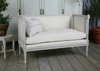
A very pretty French settee which would look great mixed with about anything including Swedish.


I have sources for these and many, many more similar pieces. I love taking these and personalizing them for my clients with fabrics which complement their homes and personalities. I will post more great finds soon.